2024 PANTONE® Color of the Year
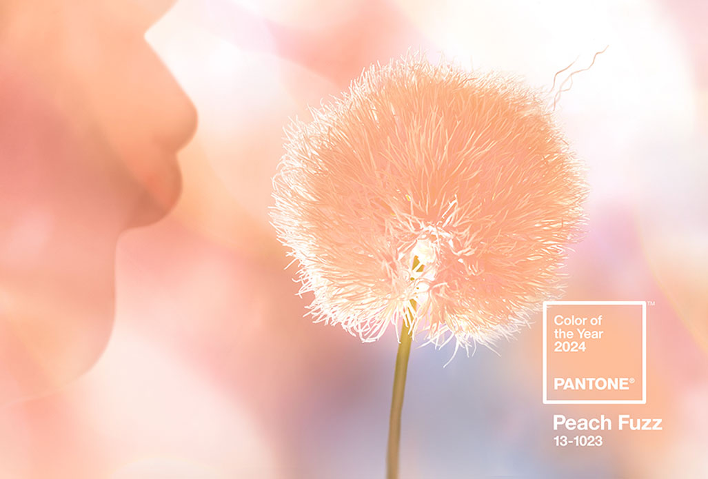
2024 PANTONE® Color of the Year Peach Fuzz【Soft Peach】
This warm and elegant soft peach shade symbolizes peace, inclusiveness, and the spirit of universal love. It enriches our minds, bodies, and spirits, fostering resonance with others.

● How PANTONE® Color of the Year is Selected
Established in 1999, the Pantone Color Institute is a global benchmark in color culture and is set to celebrate its 25th anniversary in 2024. It's a pivotal reference for famous brands, designers, and consumers in selecting colors for products and industry use. Color deeply connects with emotions. For 25 years, Pantone has influenced global industry development and decision-making, driving social media trends. The Color of the Year is selected by a team of color experts who search globally for influential hues. This encompasses areas beyond fashion and art, extending to entertainment, gaming, travel destinations, lifestyle, technology, textures, and even globally renowned sports events.


● Naming the Color of the Year
Each year’s chosen color reflects global cultural trends. The selection is based on the connection between color psychology and the zeitgeist. The name of the color immediately resonates and intuitively conveys its message. For instance:
In 2016
Rose Quartz and Serenity conveyed a sense of happiness and peaceful order.
Rose Quartz and Serenity conveyed a sense of happiness and peaceful order.
In 2021
Ultimate Gray and Illuminating emphasized how different elements support each other.
Ultimate Gray and Illuminating emphasized how different elements support each other.

● What have been the representative colors in recent years
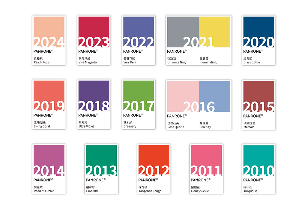
2024 Peach Fuzz
2023 Viva Magenta
2022 Very Peri
2021 Ultimate Gray / Illuminating
2020 Classic Blue
2019 Living Coral
2018 Ultra Violet
2017 Greenery
2016 Rose Quartz / Serenity
2015 Marsala
2014 Radiant Orchid
2013 Emerald
2012 Tangerine Tango
2011 Honeysuckle
2010 Turquoise
Color, as a silent language, offers a unique way to enhance packaging. By utilizing different colors strategically, not only can brands increase consumer attention and engagement, but also effectively communicate their image and values. Good use of color leaves a lasting impression, transcending time, gender, generations, and regions. Color helps in conveying messages and emotions that words alone may fail to express, making it a globally recognized visual language. This approach to color in packaging not only beautifies the product but also plays a crucial role in brand storytelling and creating a memorable consumer experience.
